
A theme is mostly invisible when it is working. You notice the writing, not the page. But the page is doing a great deal of quiet work, and a few of its decisions are yours to make. This theme has four settings for the text itself, in the Design panel of Ghost’s settings. Here is the same passage, set each way.
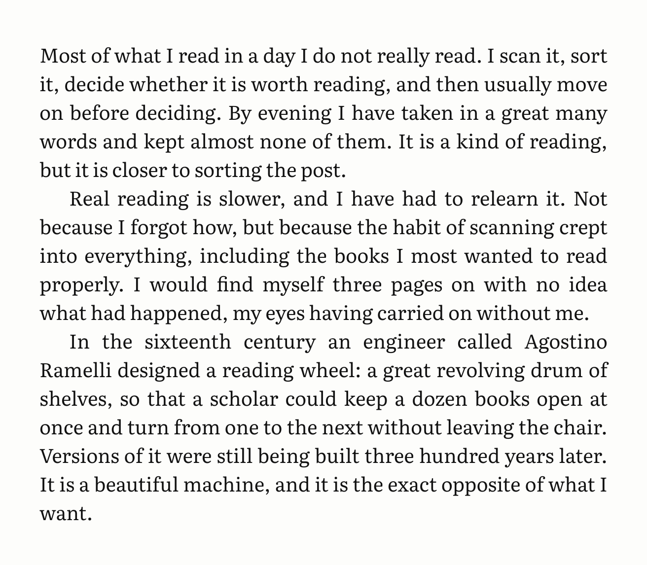
Justified and indented
The default, and the way most books are set. Lines run flush to both margins, with words hyphenated where needed so the spacing stays even. A new paragraph is marked by a small indent rather than a gap, which keeps the column dense and continuous, like a page of prose rather than a stack of blocks.
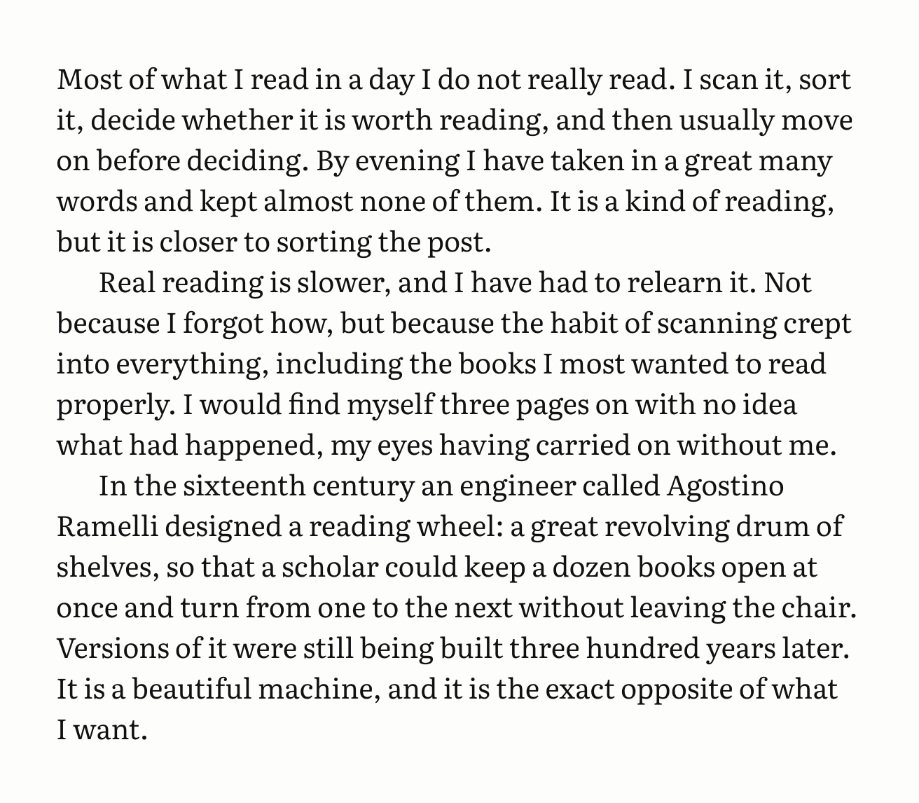
Ragged right
Lines break naturally and the right edge is left uneven. The spacing between words never stretches, which some readers find easier on the eye, especially in narrow columns. On phones the theme always sets text ragged, whatever this setting says, because a narrow column cannot justify gracefully.
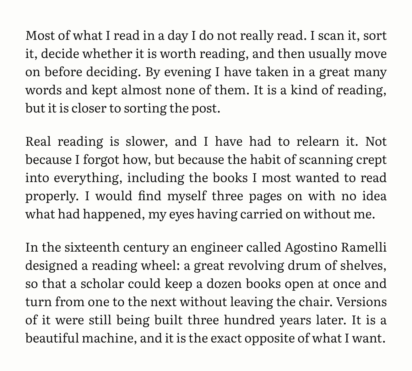
Spaced paragraphs
A blank line between paragraphs instead of an indent. It is the convention of the web and of most letters, and it suits writing made of short, separate thoughts. It pairs naturally with ragged text.
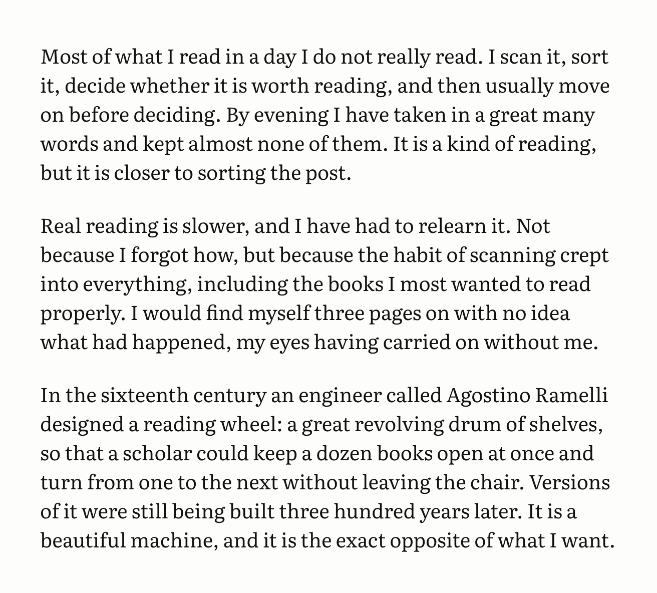
Times New Roman
The theme ships with Literata, a typeface designed for long reading on screens. If you would rather your site look like a manuscript, or simply load faster, it can use Times New Roman instead. Nothing is downloaded: Times is already on nearly every reader’s device.
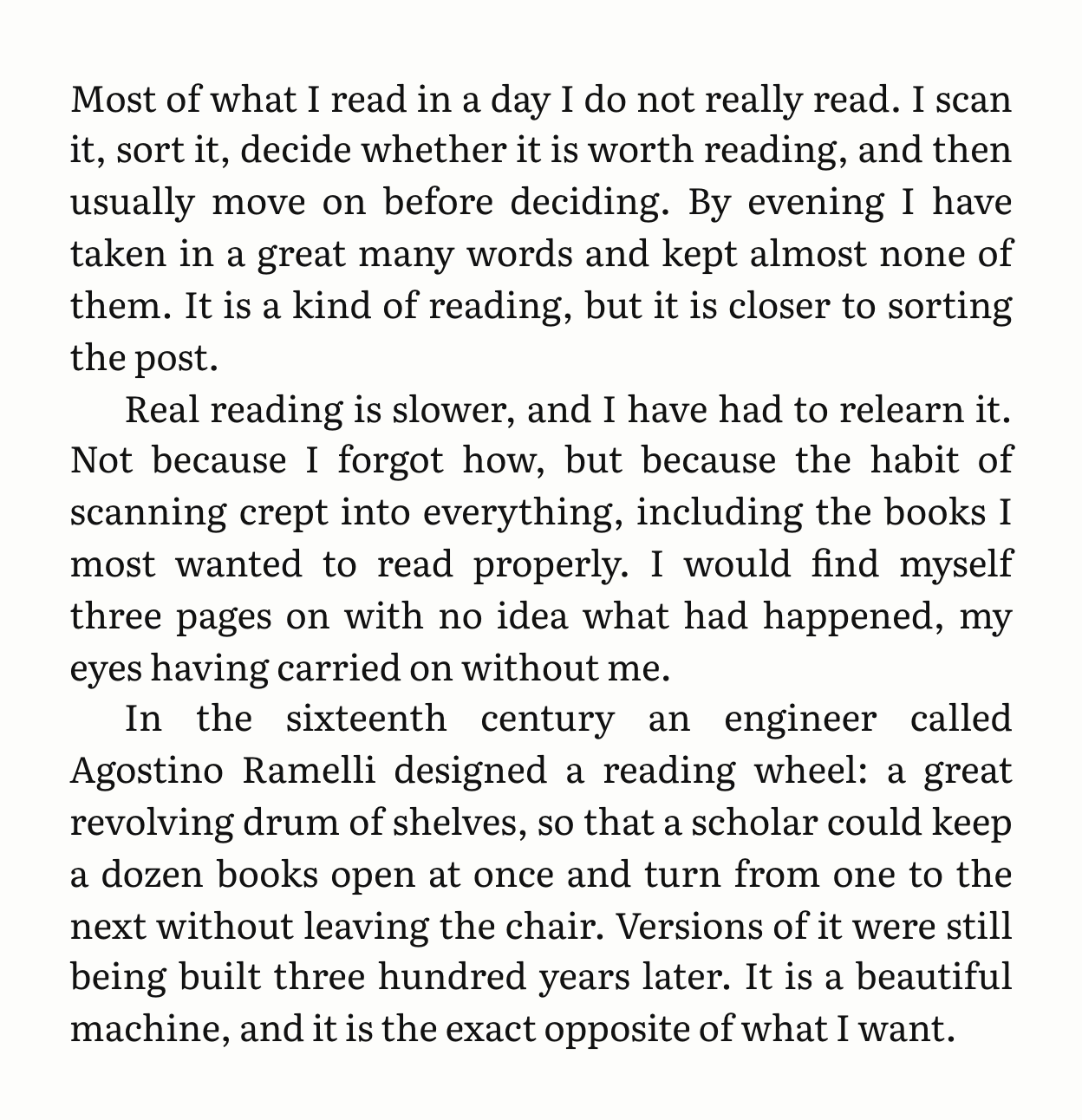
Light and dark
Finally, the colour scheme. By default the site follows each reader’s system setting, so it is light by day and dark at night if they have asked for that. You can also fix it to one or the other. To see this preview in the dark, switch your device to dark mode; the About page explains how on each system.
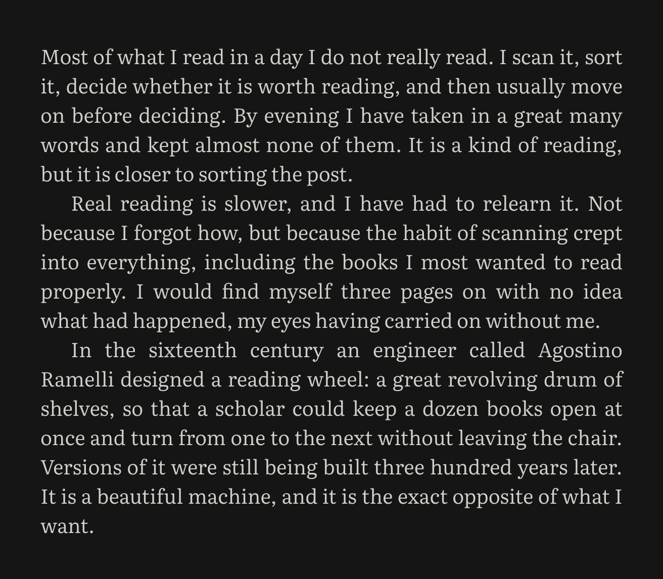
None of these settings changes a word of what you have written. They can be switched at any time, and every post on the site follows at once.